
Sponsored Content ads, or Feed Ads, on LinkedIn are used by most of our clients who invest in our Full-service PPC. It’s an effective way of getting in front of an audience, in their LinkedIn Feeds, with your latest and greatest content. If that content is high quality, and relevant, it can attract your audience and generate leads for your business. But, it’s not easy to attract an audience, let alone get them to become a lead. Let’s take a quick look at the struggle, and how we might improve lead generation results from our LinkedIn Sponsored Content ads.
FYI, LinkedIn is NOT a full Search Engine
LinkedIn is all about searching for People, Jobs, and Companies on its network. For this reason, you need to remember that the “topic” of your Sponsored Content ads is not being searched for, rather your ads are being placed in front of the audience of your choice, much like a banner. That means that you need to keep a few things in mind when building your ads.
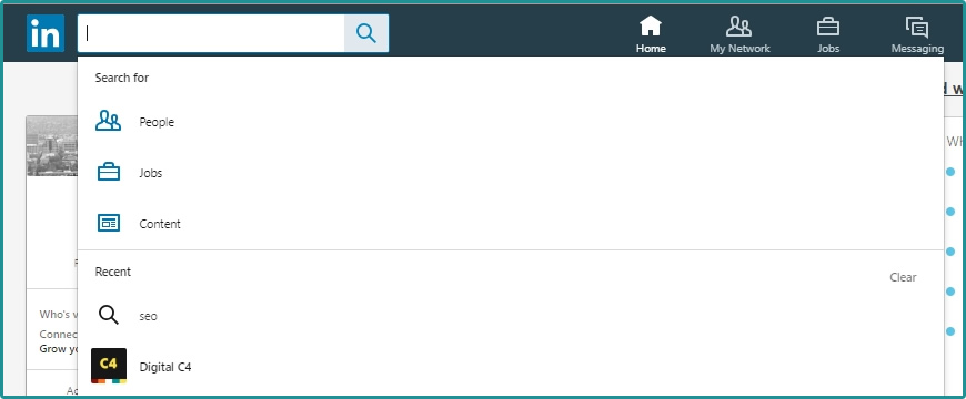
Side note, LinkedIn is working more towards improving its search function with the ability to search Content. Using hashtags and keywords in your Company Posts is becoming more important all the time. To search for content on LinkedIn, just click in the Search box next to the LinkedIn logo and you’ll see the option to search for People, Jobs, or Content. Select content and type in your keyword or topic.
Now, back to what you need to keep in mind when building your ads.
Use Relevant, Eye Catching, Graphics
I do this all the time. I’m scrolling along on my Instagram feed, my Facebook Feed, my LinkedIn Feed, and I see an ad that catches my eye. I click on it, I see if it’s something worth pursuing, and I make my decision. Since I do this for a living I pay a little more attention and click on a few more ads than most, just to see what’s up. But, we all do it from time to time.
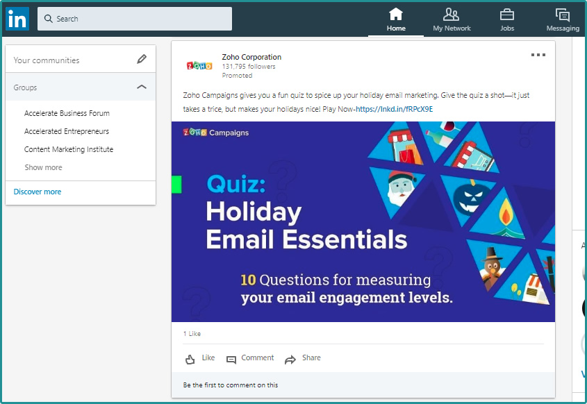
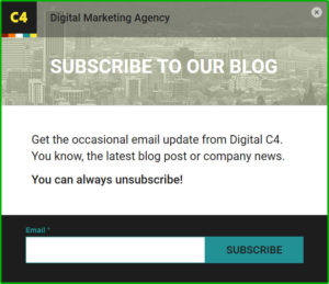
The key phrase in the previous paragraph is ‘catches my eye’. All the platforms I mentioned allow for advertisers to use images and graphics with their ads. There are restrictions, but for the most part you can use any image you want to attract. Check out this ad. Its eye catching for sure. The user will decide if they like it or not by taking, or not taking, action.
Make sure your images are quality and align with your brand. If you’re adding graphical elements to the images, make sure they align with the ad, and landing page, messaging. You might even use the same, or very similar, image on the landing page to improve relevance and the user experience from ad to landing page.
Images and graphics are as important, if not MORE IMPORTANT, as the messaging in the ad.
Use CTA’s In Your Descriptions and Titles
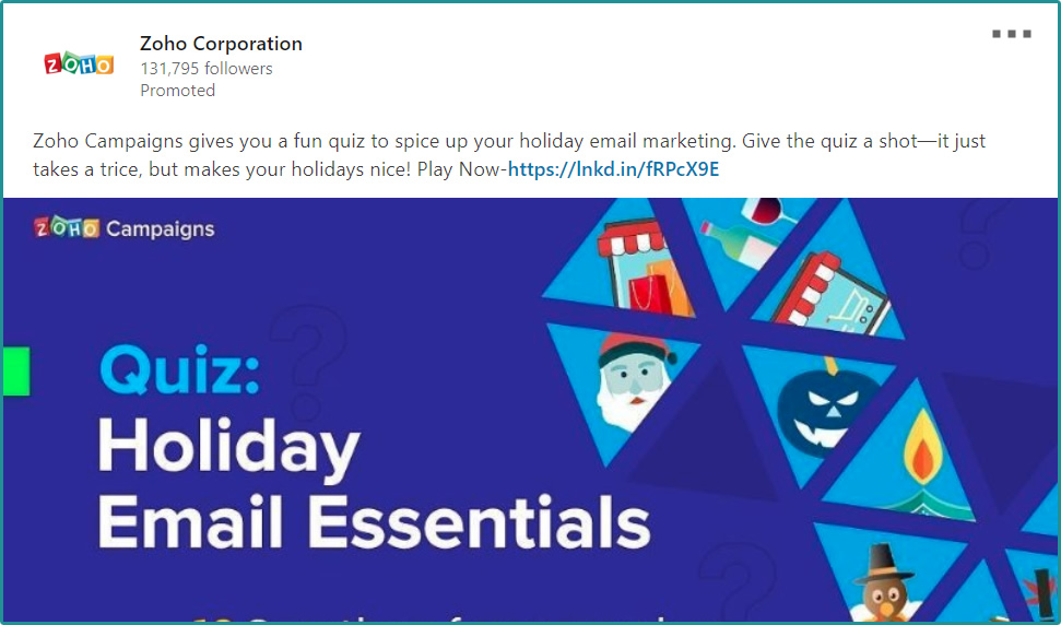
If, in your ad, you’re not specifying what you want the user to do then often they’re NOT going to do what you want them to do. Have a clear CTA (call to action) in all your ads, and on your landing pages. Don’t forget to tell the user what to do once they get to your landing page. Fill out the form, call us, watch the video, and etc. Many users will figure it out, but taking the guesswork out helps move the needle. Small movements of the needle can have large impact on campaign results! What do you think of the CTA in the ad below?
Like I said earlier, moving the needle, even a little, can improve results and reduce the struggle. We improve results through testing, testing, and more testing. It’s constant and never ending. What do we test when it comes to LinkedIn Sponsored Content, Feed Ads, and most other platforms?
Test Images/Graphics, Text, Descriptions, Landing Pages…Pretty Much Everything
Testing in advertising campaigns is a no-brainer. But where do you start? What do you test first?
We usually test two things right away, although we test them one at a time to make sure we can easily identify what works and what doesn’t.
Testing graphics/images on our ads
When we launch a new campaign we always launch with at least two ads. We create two ads with identical ad text and give each ad a different image. This is a great way to focus our attention on which image is drawing the most attention and driving the most clicks. Sometimes we’ll launch with three ads, using the same strategy.
The images and graphics should vary. One test might be to use a plain image and then an image with graphical elements on it to see which works best. Graphical elements might include a CTA button, an ad title, a corporate logo, and etc. BTW, these are all elements that can be A/B tested, as well, depending on how long your campaign will be running.
Testing ad descriptions and titles
Another way we often launch out with LinkedIn Ads is to use the same image/graphic on each ad but have unique ad text, CTAs, and descriptions.
Maybe we’re not quite sure what messaging is going to work best. Is it an ad that uses a question to grab attention or a sharp description of the content with a good offer? Launching your ads using different text options can help you see what works in short order.
It’s important to note that we don’t recommend launching out with 3 different ads, all with different text, and all with unique images. You will certainly be able to tell which of your ads worked best, but you may not completely understand why. For some marketers, that may be ok. You just want to know what works best and you don’t care why it’s the best. If this is your preference to start, eventually you’ll still land on a top performing ad, and at some point you might want to start A/B testing this top performer to see if you can improve upon it.
Testing landing pages for conversion rate optimization
We also A/B test to optimize Landing Pages to improve conversion rates. Like an ad and it’s CTR, there are metrics that we can use to determine if our landing pages are effective. Of course, the main metric is Conversion Rate. Is someone filling out the form, or completing the conversion transaction, once they click the ad and land on your page? If they aren’t then there’s likely a reason that you can identify.
First, are the ad and landing page in sync? Does the ad tell the user exactly what they are going to see on the landing page? If not, then they’re likely to bounce very quickly. An ads text, whether in LinkedIn Ads, Google Ads, or Facebook Ads, must align with the landing page’s messaging or you’ll be wasting a lot of money. BTW, any wasted money is a LOT. When we complete audits for prospects, we often find that ads are not always written to align with the messaging on a landing page. We help our clients align their messaging.
A few other landing page tests we run are:
- Variant Headlines
- Variant Header Images
- Variant Forms
Testing landing page forms
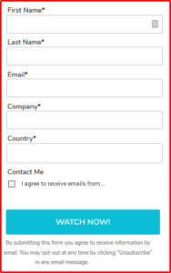 We see this all the time. We’re building a landing page for the client and they want us to embed the form from their marketing automation tool (Marketo, ActOn, Pardot, HubSpot, Hatchbuck). They send over the form and it has seven or eight fields, all required to submit. Let’s just say this, it’s very common to overbuild your forms.
Why do we overbuild forms? Because, believe it or not, marketers do want to send our sales team more MQLs. We want sales to be happy with the quality level of our leads. And if someone fills out that LONG form, they are a super qualified lead. No doubt. The problem is that if you put an eight-field form in front of a prospect that may not have heard of your company thirty seconds ago, they’re going to say “heck no”. They’ll bounce even though they WERE interested.
Quick side note, I’m a fly fisherman. I can’t tell you how many times I’ve seen a fish rise up from the depths only to turn away at the last second, for some reason. Was the artificial fly too big, was it the wrong color, was it moving across the water in an unnatural way, or did the fish see me standing there? All these are possibilities. So, I must test and figure it out. If I know that fish is there, I will stay there longer testing different things to try and catch’em.
 So, back to marketing… if you’re putting an eight-field form in front of a prospect they’re going to be like that fish. They’re attracted by your ad, get to your landing page, and then turn away because the cost or hurdle (the form fill) is too high.
Hey, we know forms sometimes need to be a bit longer. We’re just recommending having the smallest form possible on your landing page. If you’re using a marketing automation tool, then maybe you can simply ask for the email address. Get them into your drip marketing campaign and build the prospect profile in your system over time. Maybe you ask for Name and Email, and only email is required. The point is, make the hurdle low. W
The last I’ll say about forms is that the form size, or length, should match the funnel level of the prospect you’re trying to reach. If they’re a top of the funnel prospect, keep the form to 1-3 fields. As the prospect gets deeper into the funnel the form can get longer, but it should always be the minimum size you need. You then can use other methods to close the deal. Trust me, a B2B lead generation landing page and form are NOT going to close the deal. So, don’t create your form thinking it will.
B2B Lead Generation Conversions Do Happen
I don’t want sugar coat anything. Generating B2B leads is a struggle. There is so much NOISE out there with ads and advertising that most of us just gloss over ads when trying to get to the content we want.
The key for marketers is to be there when our content will be the content someone wants. We also can use the testing methods I’ve discussed in this post to get attention, and maybe influence an audience to be interested NOW, even if they weren’t a minute ago.
Are you responsible for generating B2B leads? Do you find the struggle overwhelming at times? We all do. Reach out to us. We’d love to know how you overcome and succeed! We also do free PPC audits, so feel free to take advantage of us.
